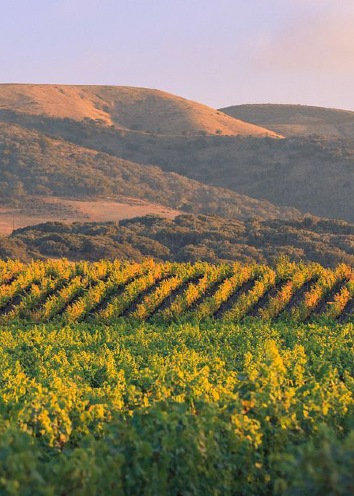
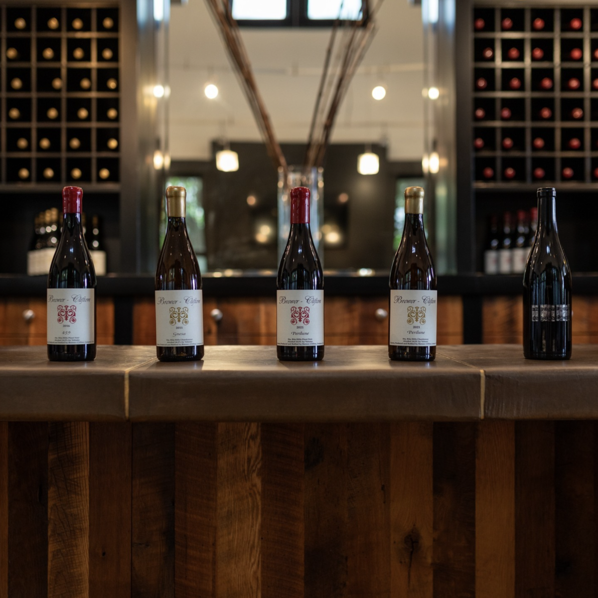
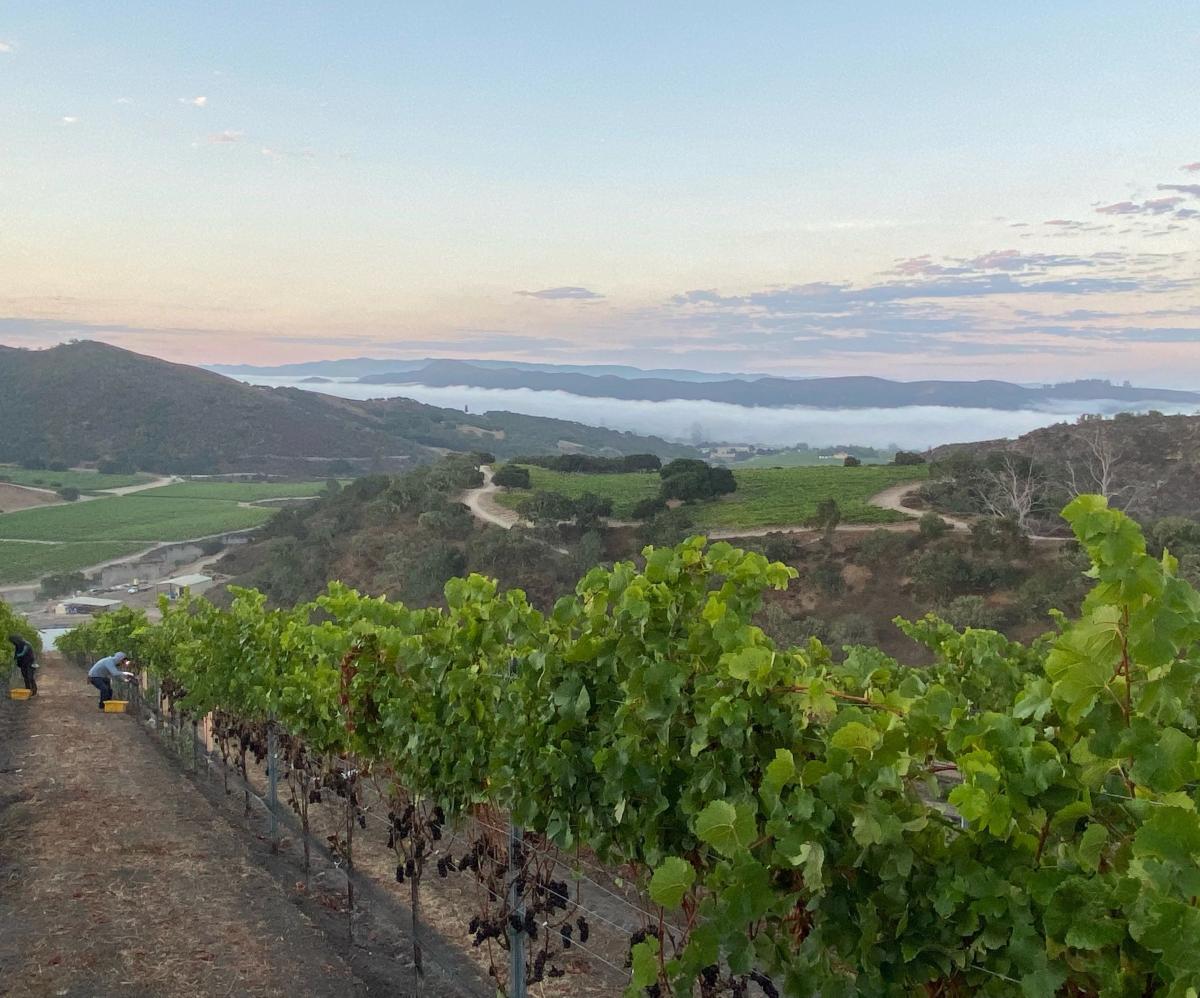
The landscape of the Sta. Rita Hills has always been evocative of something lunar for us. Stark, empty, open and contemplative. The specific terrain of our Perilune vineyard is no different in its topography marked by wind swept and barren slopes coupled with dramatically steep sandy cliffs. Comprised of a vast array of elevation, aspect and soil profile, Perilune is by far and away the most ambitiously complex of all of our vineyards. From beach sand to botella clay, the rugged terrain and dramatic inclines offer a myriad of opportunities for dynamic fruit expression.
Perilune
All at once familiar and still foreign, in 2022 we endeavored to explore facets of this parcel in ways that previously we had not. We asked ourselves how we could demonstrate the voice of this place in a manner somehow divergent from Brewer-Clifton. We wished to remain steadfast in our prioritization of neutral vessels, yet were desirous to arrive at a new means of site expression.
Origin
One singular concrete egg was the clear pursuit and our deliberate choice. The egg’s size, shape, texture and spirit seemed perfectly aligned with all of our objectives. Volumetrically confining yet liberating in its representation of incubation and birth. In the winery the visual appearance seems to emanate from a place within space or even something vehicular to access it.
PERILUNE VINEYARD
CHARDONNAY
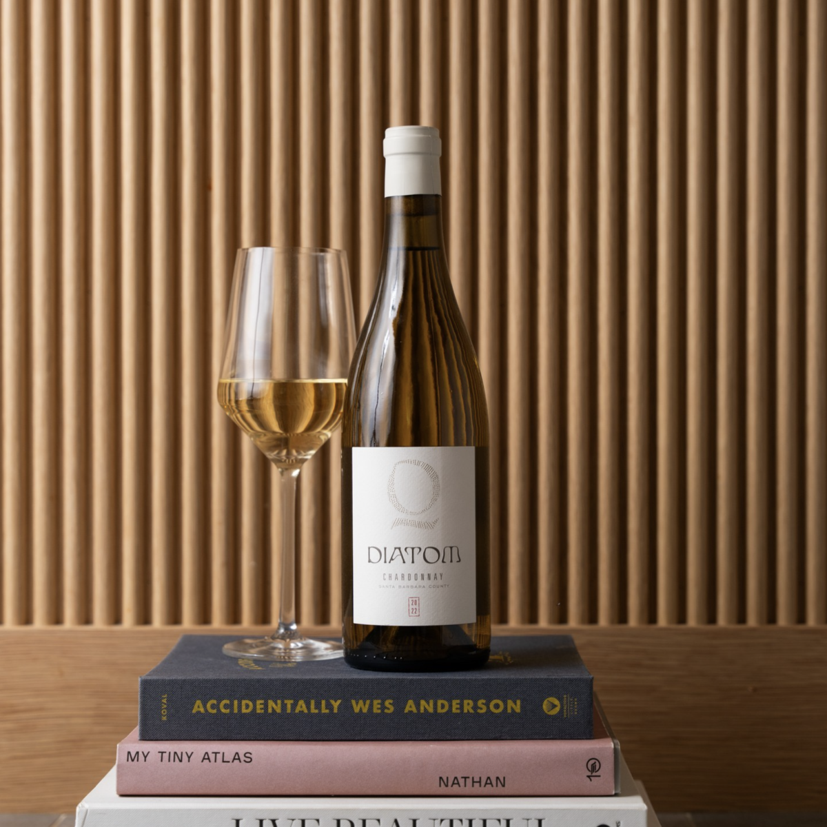
The Chardonnay is sourced from a single block of clone 17 which is harvested well before our typical range to capture a higher octave and less fruit forward voice of place. Inhibited malolactic for clarity and precision further hone in on that objective with subsequent upbringing on non-disturbed yeast lees. Our Chardonnay is bottled in the late summer months immediately before the subsequent harvest season with anticipated release after six months in bottle.
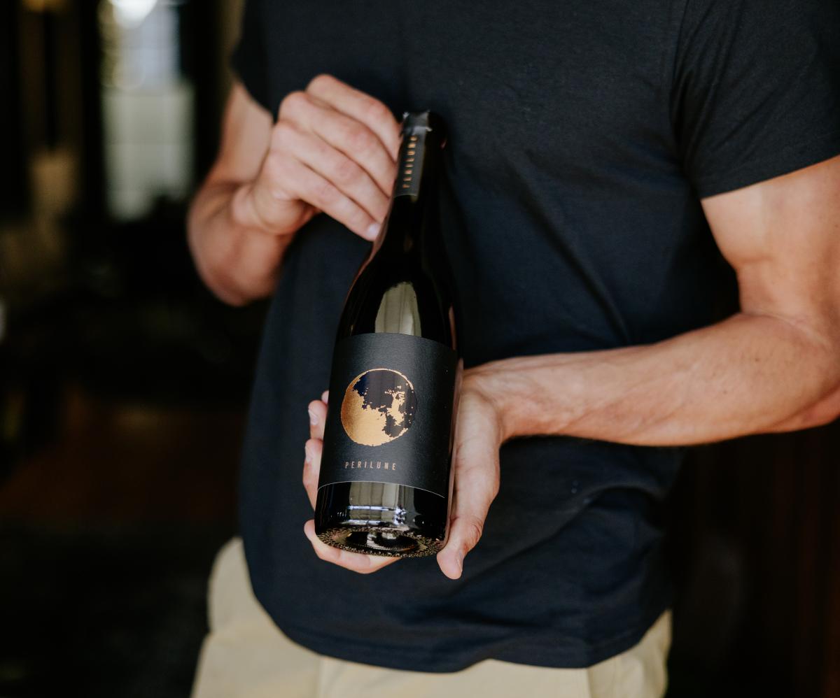
PINOT NOIR
The Pinot Noir is sourced from the highest elevation portion of the vineyard at just over 1,000 feet. Purely clone 114 which is entirely de-stemmed prior to fermentation. After a long cuvaison in one small fermenter, the wine is pressed directly into a single egg for it to then evolve within. Our Pinot Noir is bottled in the late summer months immediately before the subsequent harvest season with anticipated release after six months in bottle.
BEHIND THE LABELS
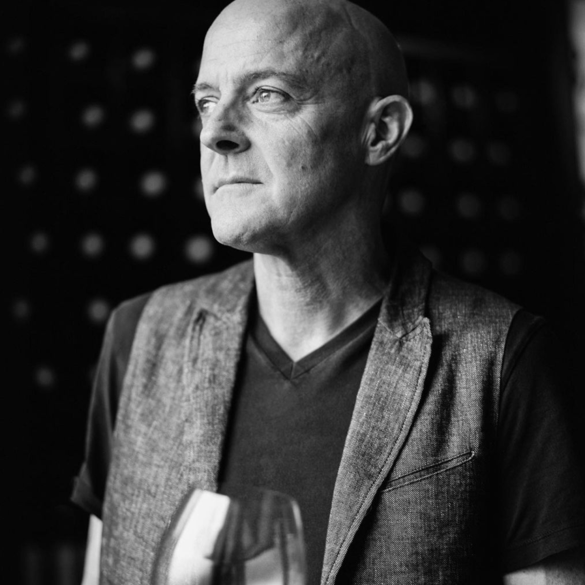
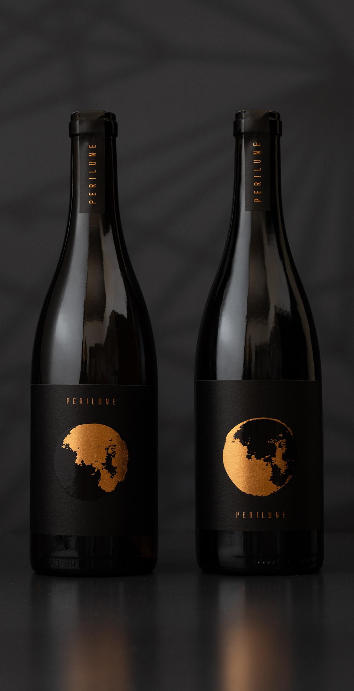
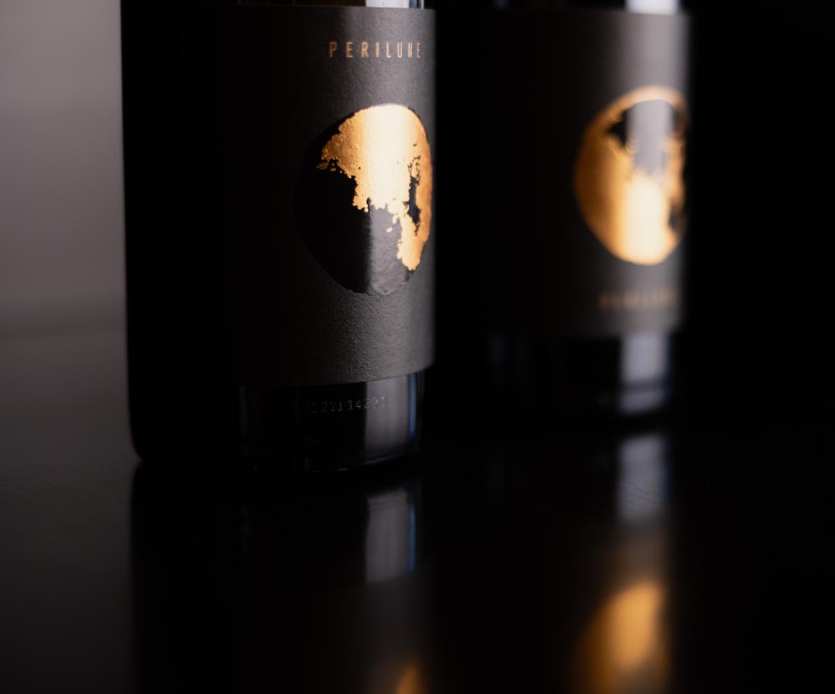
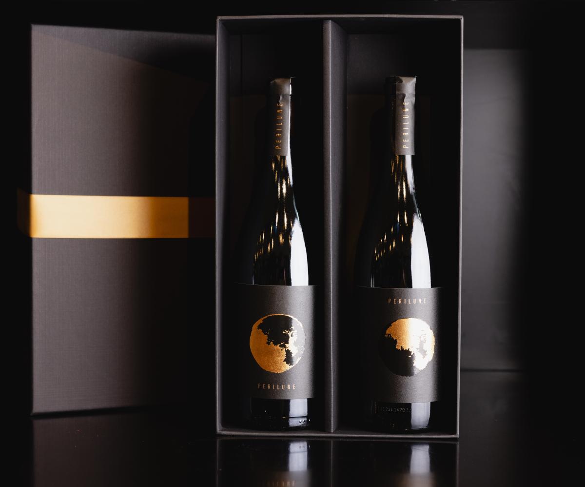
Collaborating closely with Greg Brewer, Senior Designer Tami Lovett-Brumfield explored label concepts reflecting a lunar path. Her inspiration for Perilune came from Greg Brewer himself and his winemaking philosophy. “In our initial Perilune meeting, the brand was described with words like round, orbital, calming/quiet, ephemeral, and textural, inspired by the vineyard’s lunar-like topography. To capture this, I created hand-crafted textures and backgrounds using traditional sumi ink, Indian ink, black gouache, and acrylic paints on natural papers, applied with various tools to maintain an organic feel. These elements were digitized and assembled into designs that balanced literal and emotional interpretations of space, reflecting calmness and quiet. The final design incorporated dark and light contrasts with a Zen-like quality.”

